Instructions
Creating a Two-Column Food Menu Using Bootstrap and Viewing it in the Browser Lab
Introduction:
In this lab, you will build a responsive two-column food menu for Little Lemon using the Bootstrap Grid system. You'll display the Little Lemon logo and arrange menu items into two columns.
Goal:
The goal of this lab is to build a responsive, visually appealing webpage for Little Lemon that showcases a two-column food menu. This will be achieved by using the Bootstrap Grid system to create a structured layout with a centered logo, menu title, and organized menu items.
Objectives:
Set up a responsive webpage using the Bootstrap Grid system.
Utilize Bootstrap classes to create a structured container with rows and columns.
Center-align elements such as images and text using Bootstrap utility classes.
Build a two-column layout for menu items that adapts to various screen sizes.
Apply responsive design principles with Bootstrap classes like col-12 and col-lg-6.
Instructions:
Part 1: Creating a Two-Column Food Menu Using Bootstrap:
Step 1: Set up the bootstrap container.
Open the index.html file present under the PROJECT folder.
Locate the <body> tag in the file. Add a <div> inside the <body> element with the class container. This will be the main Bootstrap container for the page content.

Inside the container <div>, add three <div> elements, each with the class row
The first row will hold the Little Lemon logo.
The second row will hold the menu title.
The third row will hold the two-column food menu.

Inside the first row <div>, add a child <div> with the class col-12. This will make the logo span across the entire row.
Add another <div> inside the col-12 <div> with the class text-center to center-align the logo.
Add an <img> tag inside the text-center <div>.
Use src="logo.png" to refer to the logo image.
Add the img-fluid class to make the logo responsive.

Inside the second row <div>, add a child <div> with the class col-12.
Add another <div> inside this col-12 <div> with the class text-center to center-align the title.
Add an <h1> tag inside the text-center <div> with the text Our Menu.

Inside the third row <div>, add two child <div> elements:
Each <div> should have the class col-12 col-lg-6.
These classes make the columns stack vertically on smaller screens and display side-by-side on larger screens.

In the first col-12 col-lg-6 <div>, add:
An <h2> tag with the text Falafel.
A <p> tag with the text Chickpea, herbs, spices.
An <h2> tag with the text Fried Calamari.
A <p> tag with the text Squid, buttermilk.
In the second col-12 col-lg-6 <div>, add:
An <h2> tag with the text Pasta Salad.
A <p> tag with the text Lettuce, vegetables, mozzarella.
An <h2> tag with the text Greek Salad.
A <p> tag with the text Cucumbers, onion, feta cheese.

Part 2: Viewing Your HTML Document in the Browser:
Step 1: Start the live server.
At the bottom-right of the editor, click on the Go Live button.
Once the server is up and running, you will see an exposed port number (e.g., 5500). This means your server is now live.
Step 2: Open the browser preview: At the middle-left of the editor, click on the Browser Preview button to open a new Browser Preview tab.
Step 3: Enter the URL in the browser: In the browser, enter the following URL format (replacing <exposed port> with the actual port number shown in the editor): http://localhost:<exposed port>.
Step 4: Check that the web page displays: Once the URL is entered correctly, the webpage will load, and you should see the Little Lemon menu webpage based on the layout that you have defined in the index.html file.
Step 5: Close the server after completing the lab: Once you’re done with the lab, make sure to close the server to free up the port:
Click on the exposed port number (e.g., 5500) at the bottom-right of VSCode.
You should see a notification confirming that the server is now offline (stopped).
Final Output:
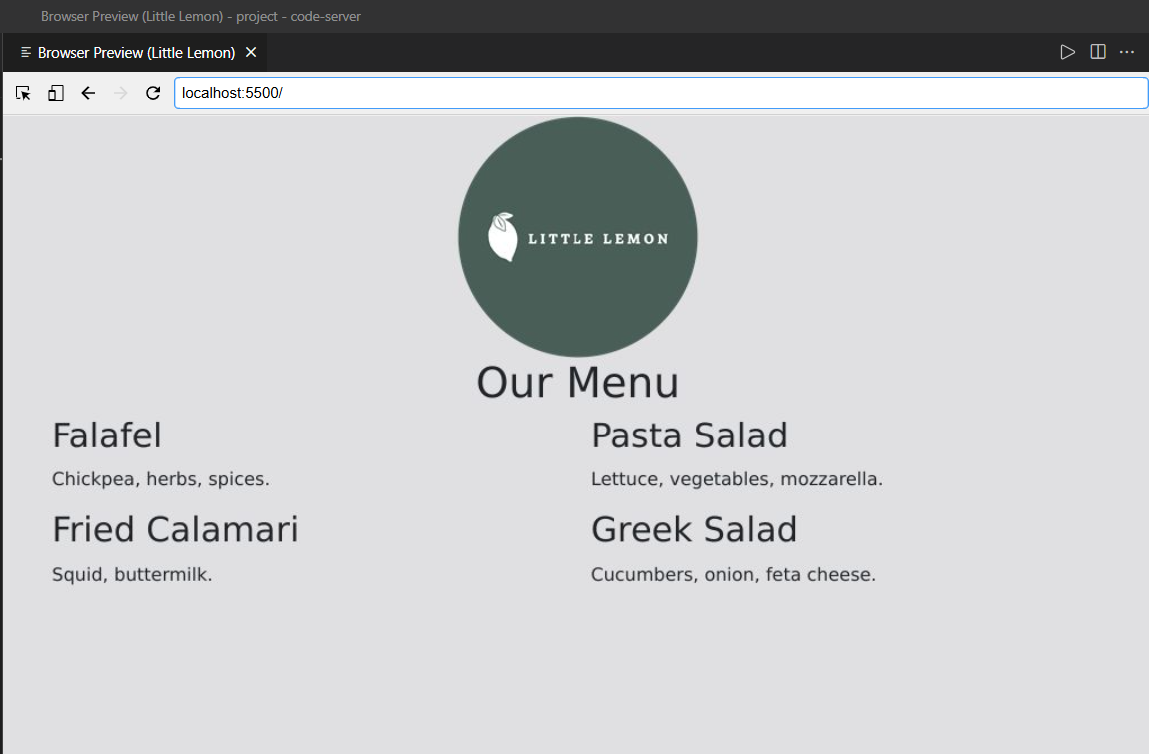
Note for Learners:
When using the browser preview functionality in the machine environment, the webpage layout may initially appear with both columns stacked vertically, each taking up the full width (using the col-12 class). This is because the browser preview defaults to a smaller screen size (mobile view), which applies the col-12 class to each column, making them stack on top of each other.
However, if you want to see the two columns side by side (with each column taking up 50% of the width on large screens), you can expand the screen size of the browser preview panel. This will trigger the col-lg-6 class, which adjusts the layout to show the columns side by side on larger screens.
Key Takeaways:
Use the Bootstrap Grid system to create responsive layouts.
Center-align content using utility classes like text-center.
Make images responsive with the img-fluid class.
Understand how classes like col-12 and col-lg-6 help create adaptable designs.
Final Step: Mark as Completed
Click the Mark as Completed button present below to mark the lab as Completed.


No comments:
Post a Comment